[Weekend Poll] Cyanogen Inc’s New Logo: Hot Or Not?
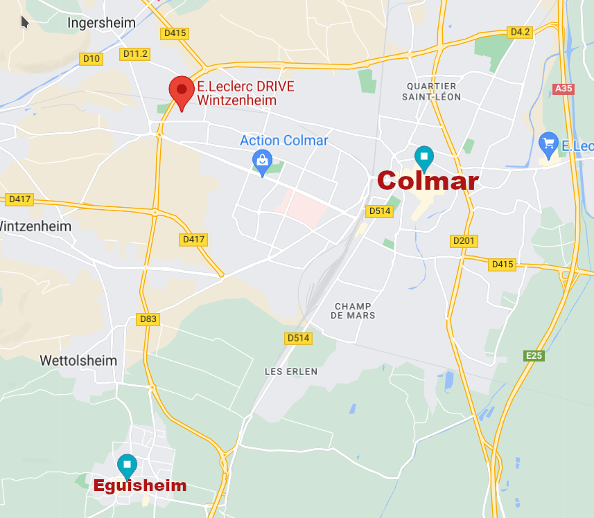
Doporučuji po příjezdu zaparkovat u radnice – viz šipka. A i pokud člověk nejede vozem, tohle je nejlepší místo, kde začít.

Na zdi radnice u parkingu je totiž vypsaná většina vinařů, ke kterým se dá zajít na ochutnávku. Otevřeno mají obvykle 8-12 a 14-18, navíc obvykle mají zavřeno v pondělí – přesné dny se ale liší.


Restaurace
Obecně ve Francii mají restaurace otevřeno maximálně 5 dní v týdnu (asi odborová podmínka), otevřeno bývá pouze v čase oběda (12-14) a večeře (19-21). V turistických destinacích je skoro nutnost si stůl zarezervovat. To jde buď telefonicky (když mají otevřeno), osobně (když mají otevřeno), někdy přes web (pokud funguje).
Jidlo - Eguisheim
Boulangerie
 Otevřeno denně dopoledne, v neděli jediný otevřený obchod vůbec.
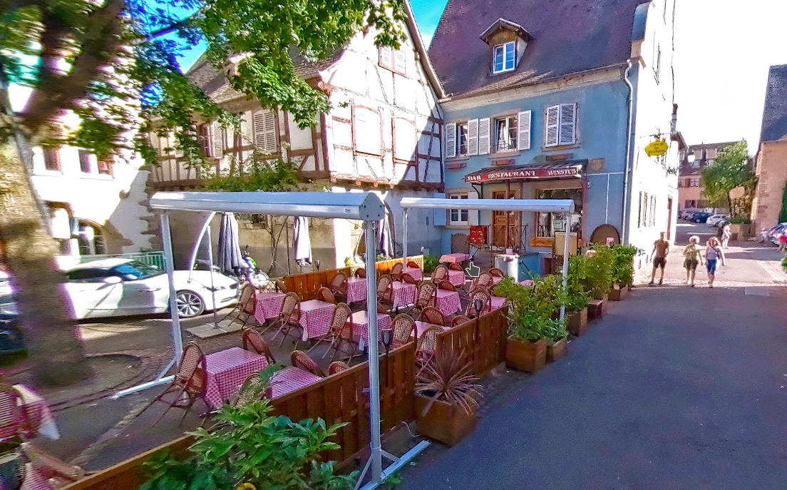
La Taverne de Chateau
 Turistická taverna, jako snad jediná je otevřená skoro pořád a není třeba rezervovat. Nabídka spíš turistická, hlavně slané koláče „Flammekuche“ s různou náplní.
Caveau Heuhaus
 Restaurant ve sklípku. Běžné alsaské speciality, netřeba rezervovat, usadí vás k prázdnému stolu, když někdo odejde. Mají otevřeno 10-22, údajně zavírají jen v úterý, nicméně měli zavřeno i ve středu.
Caveau d'Eguisheim
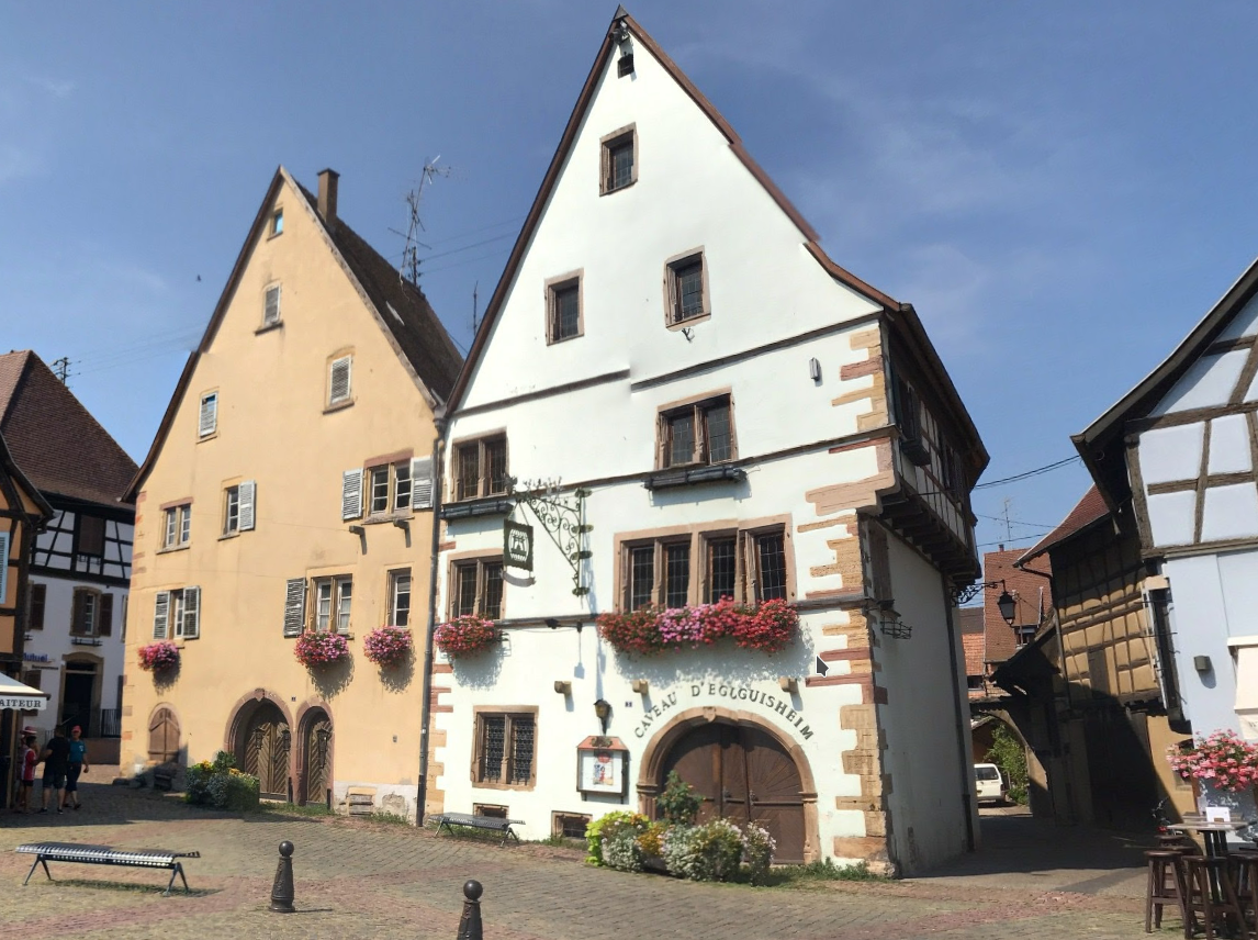 „Lepší“ restaurant snad Michelinská, bez rezervace bez šance, vyšší ceny. Nevyzkoušeli jsme.
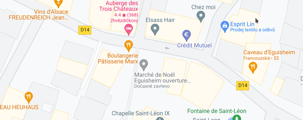
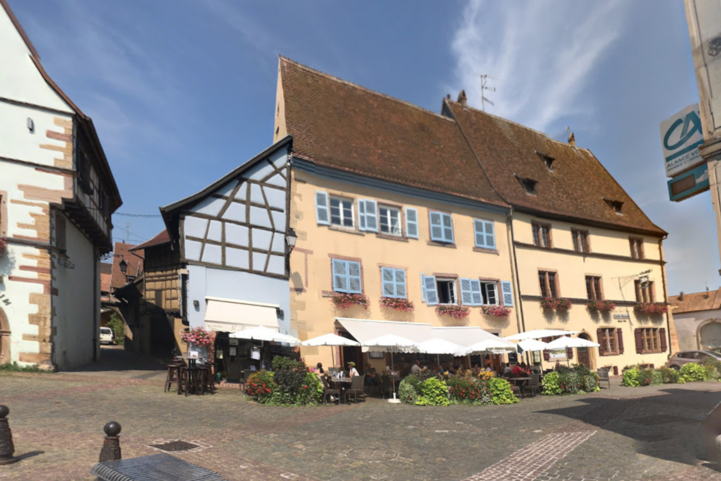
Auberge des Trois Châteaux
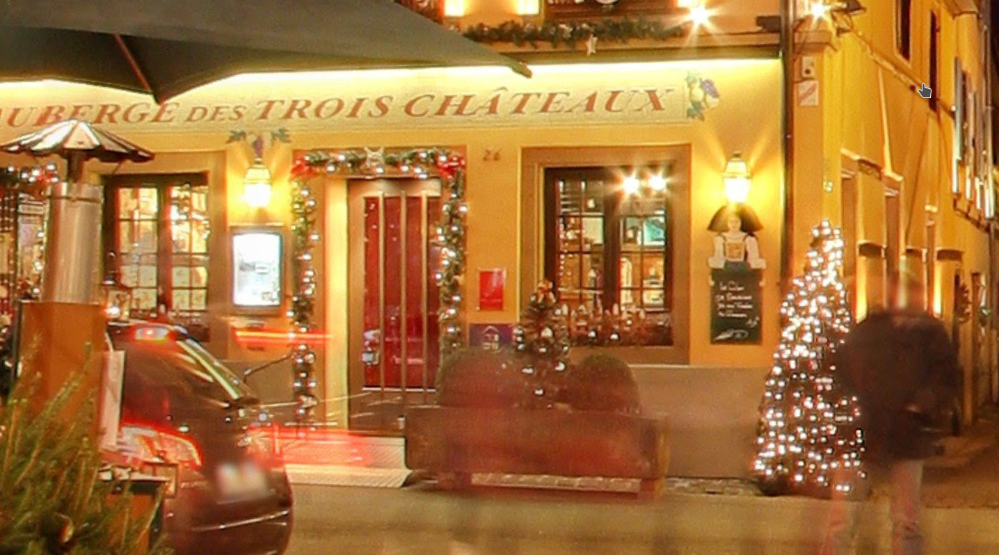 Tradiční alsaská kuchyně, typická jídla – vepřové koleno, vařené hovězí s křenem apod.
Caveau des Doucers
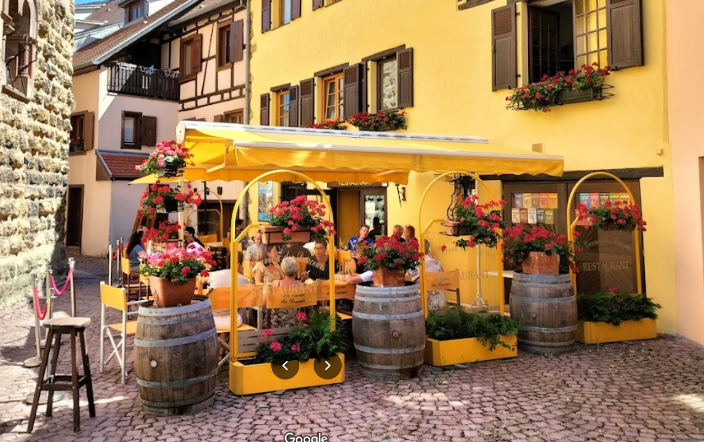 Vynikající restaurant, nicméně je potřeba rezervovat jak na poledne, tak na večer. Pokud někdo dojí a odejde, už nikoho dalšího neusadí.
À la ville de Nancy
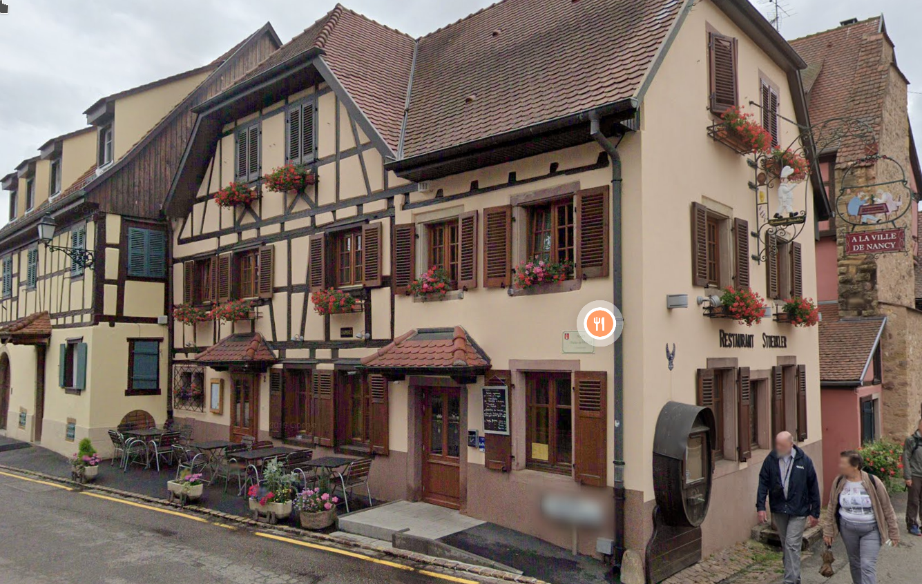 Restaurace s místy i v patře, čili obslouží víc hostů. Mix alsaské a francouzské kuchyně, hovězí z Anglie, jehněčí francouzské (po tom měl F. střevní potíže). Lépe rezervovat telefonicky.
Okolí
La Taverne Medievale, Gueberschwihr
r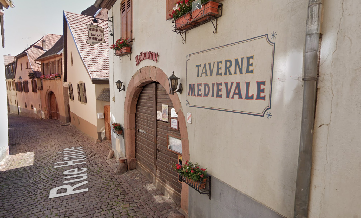 Velmi slušná restaurace, bohužel trochu „z ruky“. Výborná lokální kuchyně plus něco z jiných částí Francie. Nutno rezevovat telefonicky.
Boutique Canoie, Gueberschwihr
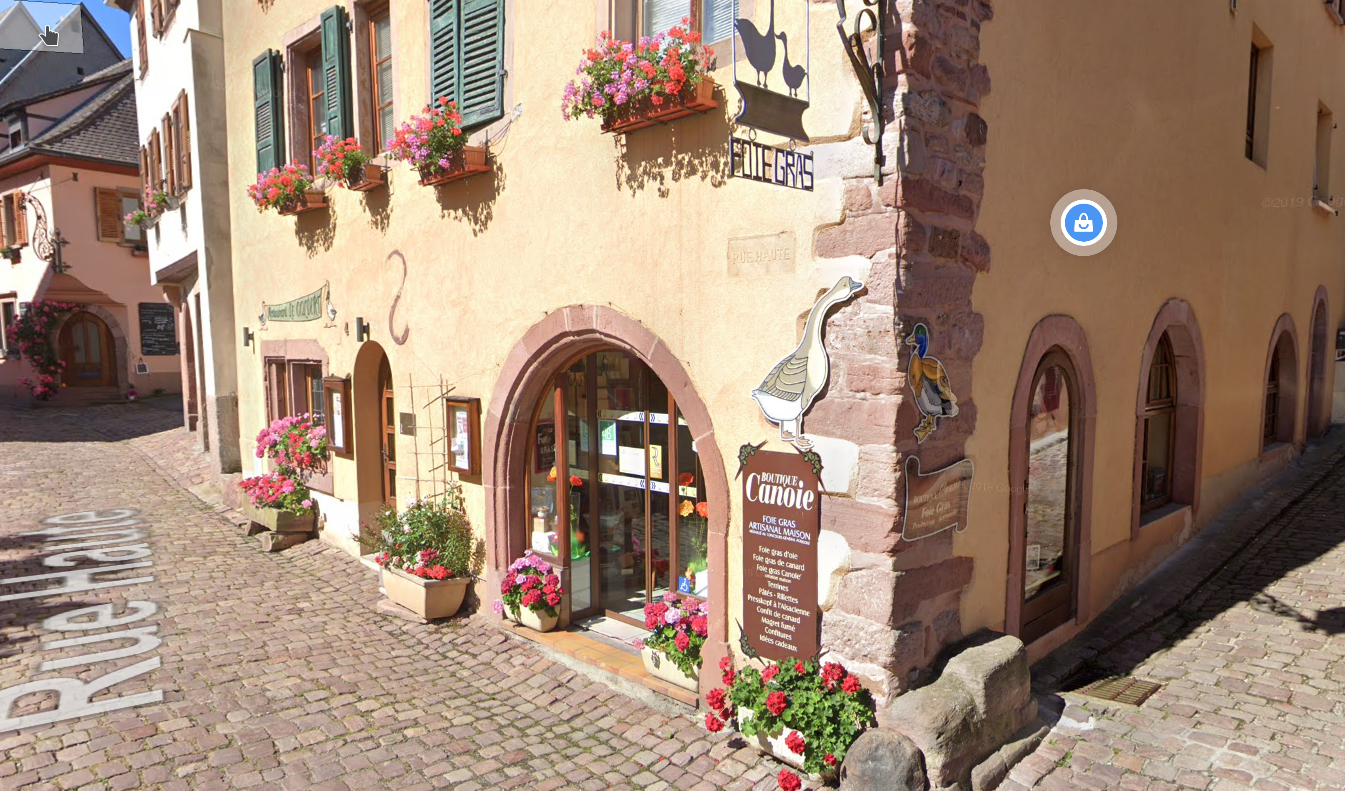 Řemeslná výroba a prodej Foie Gras